In today’s competitive business landscape, a memorable brand is the cornerstone of success, and its visual identity plays a pivotal role in making it unforgettable. At the heart of this visual identity lies one essential yet often underestimated element: colour. It’s far more than just a design choice—colour has the power to evoke emotions, shape perceptions, and even influence purchasing decisions. From your logo to your website, colour is a subtle but mighty force in your branding arsenal, playing a huge part in how your brand is perceived by your audience.
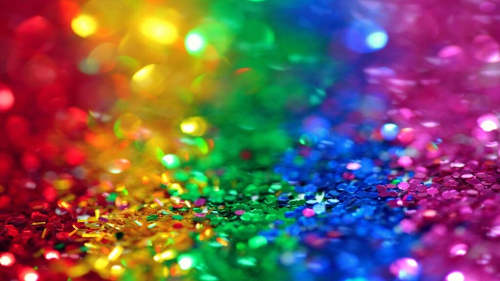
Colour Psychology: Understanding the Power of Hue
The true power of colour in branding lies in its ability to communicate messages on a subconscious level. Every colour carries its own set of psychological associations and emotional triggers, and when you use these intentionally, you can shape the way your audience feels about your brand.
For instance, some colours are often seen as trustworthy, calm, and professional, which is why many financial institutions, healthcare companies, and tech firms use them in their branding. Other colours, in contrast, radiate optimism, energy, and creativity, making them go-to choices for brands that want to convey excitement, innovation, or a youthful vibe. Similarly, other colours are associated with passion, excitement, and action, which is why many brands in the fast-food industry use them to evoke a sense of urgency.
By understanding how colour impacts the emotions of your target audience, you can choose shades that align with your brand’s core values. Every colour should serve a purpose, whether it’s to build trust, evoke excitement, or communicate a sense of luxury. As you explore colour psychology, think of your brand as a conversation. Each hue you choose tells your audience something about your personality and what you stand for.
Building Your Brand Personality Through Colour
Your brand’s personality is the foundation of your identity. Are you bold and adventurous? Calm and trustworthy? Playful and fun? Understanding your brand’s unique characteristics is essential to crafting a colour palette that aligns with its values and voice.
Here’s how some common personality traits translate into colour choices:
- Bold & Powerful
- Calm & Trustworthy
- Friendly & Energetic
- Luxurious & Elegant
- Fresh & Natural
- Playful & Fun
Take a moment to define your brand’s personality, and let that guide your colour choices. Just like you wouldn’t wear a tuxedo to a beach party, your branding’s colours should match your brand’s vibe. Your colour palette should feel intentional and consistent, setting the right tone for how you want to engage with your customers.
Contrast and Simplicity: Finding the Right Balance
Once you’ve chosen the core colours that reflect your brand’s personality, the next step is to create balance and impact. That’s where contrast comes in. The magic of colour lies in its ability to create contrast, which helps important elements in your design stand out. A high-contrast design can grab attention, guide the viewer’s eye, and make your message easier to digest.
For example, think of a bright call-to-action button on a contrasting background. The bold contrast makes the button impossible to ignore. Similarly, a vibrant logo on a neutral background draws immediate attention without feeling overwhelming.
But contrast is a delicate balance. Too much of it can result in visual chaos, making your brand feel jarring and disconnected. Colour contrast should be used strategically to highlight important elements, such as call-to-action buttons or key headlines, without overwhelming the viewer with too many competing colours.
At the same time, simplicity is key. The most iconic brands rely on a limited, focused colour palette. When it comes to branding, less is often more. A minimal palette allows for consistency across all your materials and ensures that your brand remains easily recognizable.
The Power of a Focused Colour Palette
To create a truly memorable brand, your colour palette should be simple, intentional, and consistent. While it may be tempting to use a variety of colours to express your brand’s many aspects, remember that the most effective brand identities often come from a small, cohesive set of colours. These brands have achieved global recognition not through the number of colours they use, but through their consistent, strategic application.
The idea behind this simplicity is to create a visual identity that’s easy for your audience to recall. Overloading your design with colours can create confusion, making your brand feel inconsistent. Keep your colour palette to a primary colour, a secondary colour, and a few accent colours, and let those hues define your brand’s essence.
Stay Timeless, But Don’t Shy Away From Trends
While your colour palette should be timeless, there’s also room to experiment with colour trends. After all, staying current is important in a fast-evolving market. However, when you introduce a trendy colour into your design, make sure it doesn’t compromise your brand’s long-term identity. A smart approach to colour trends is to incorporate them sparingly and strategically, ensuring they still align with your brand’s core message.
Take, for instance, Pantone’s Colour of the Year. While this may be an exciting addition to the design world, it doesn’t mean every brand should overhaul their entire colour palette to align with the latest shade. Instead, experiment with subtle touches—like using the trend as an accent or in specific marketing campaigns—while keeping your core colour scheme intact. Your brand should always prioritize timelessness over trendiness.
Testing and Refining Your Colours
Once you’ve settled on your colour palette, the next step is testing. Before rolling out your new colours across all platforms, you should put them to the test. A/B testing can help you determine which combinations resonate best with your target audience. For example, you might test different button colours on your website to see which drives higher conversion rates, or experiment with different colour schemes in your social media ads to measure engagement.
Testing provides valuable insights into how your colour palette influences your audience’s behavior. This iterative process of refinement will help ensure that your design decisions are optimized for maximum impact and customer connection.
Cultural Significance of Colour: A Global Perspective
When expanding your brand’s reach, especially in a global market, it’s crucial to consider the cultural significance of colour. Different cultures interpret colours in various ways, and what works in one country may not work in another. For example, while red symbolizes luck and prosperity in many Eastern cultures, it may signify danger or warning in other parts of the world. Similarly, white is seen as a symbol of purity in the West, but in some Eastern cultures, it’s associated with mourning.
As your business grows, understanding these cultural nuances becomes essential. You don’t want a colour palette that inadvertently offends or alienates your audience. If you’re aiming for a global presence, take the time to research how different cultures interpret colours. This will help you tailor your branding to resonate universally, without crossing any cultural boundaries.